4 Ways You’re Sabotaging Your Website’s Calls-to-Action
If you’ve been marketing for any length of time, you understand the importance of calls-to-action. Without effective CTAs, your prospects will be...

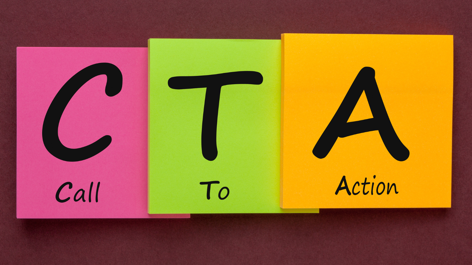
The call-to-action (CTA) could quite possibly be one of the most overlooked components to any online marketing strategy. Whether you’re running retargeting banner ads, paying for a sponsored Facebook post, or just putting the right buttons on your site or your own blog, a CTA can make or break your marketing campaign.
A call-to-action is a button or a link or a graphic that asks prospect customers (or any given audience) to take a specific action. The action could be to learn more, to read a case study, to complete a form, to download an eBook, to request a consultation, to subscribe to your newsletter, or an unlimited number of other possibilities that depend on your marketing objectives and the target’s needs. You include these opportunities to encourage the reader to take some step in the right direction.
A CTA used on your website or blog is an essential component of inbound marketing. It is used to produce leads and generate conversions. It does this by linking regular blog content to premium content—via a landing page that has more information about that premium content as well as a form the visitor must complete in order to access that content. When they complete the form, which includes at least their name and email address, they become a lead.
The more you use CTAs and track the results, the better you’ll get. But I suggest you begin with these best practices for every CTA you create from this day forward.
No, really. Try to choose colors that stand out yet also compliment your overall design. A handsomely designed CTA will go a long way in adding credibility to the offer as well.
Less is usually more when it comes to CTAs. It’s a little ad, so a few words is best; save the heavy copy for the landing page. Remember, the goal of the CTA is just to get people to click. The landing page will serve the purpose of getting them to take that next action.
“Download now” or “Click here” or “Register” are all great ways to be action-oriented. Be very clear about what you want the visitor to do.
Your CTA should pop, it should be easy to read, and should be big enough that it can’t be ignored.
Maybe this is obvious, but don’t send the visitor to your homepage or to any page other than a specific landing page that is about this specific offer and nothing else. Be totally focused on your CTA button and equally focused on the landing page. If you’re inviting someone to subscribe, make sure they are being sent to a subscription page.
These basics apply to that CTA that you will put at the bottom of a blog post, but there are other places you can insert CTAs. They’ll be welcomed by your visitors and will benefit you. For example, text CTAs within your blog post can direct the reader to that same landing page or, if appropriate, to a different landing page. And think about the rest of your website—where can you add CTAs to offer additional content to visitors and offer yourself more opportunities to convert visitors into leads?

If you’ve been marketing for any length of time, you understand the importance of calls-to-action. Without effective CTAs, your prospects will be...

In the world of marketing, calls to action are absolutely vital. No nonsense, powerful marketing is created through a series of steps down a funnel,...

When it comes to inbound marketing success, more sales qualified leads should mean more revenue. And, to obtain more leads, you must get your...
