.png?width=2250&height=647&name=LeadG2-logo_(2).png "LeadG2-logo_(2)")
 LeadG2


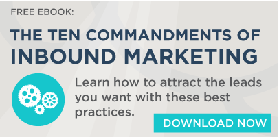

Inbound Marketing Commandment #7: Thou Shalt Create Lead Generation Materials
 LeadG2 : November 14, 2016
As part of the LeadG2 series on "The 10 Commandments of Inbound Marketing" we're looking at each of these ten commandments and the importance of each...